![joomag logo blue-3.png]](https://help.joomag.com/hs-fs/hubfs/joomag%20logo%20blue-3.png?height=29&name=joomag%20logo%20blue-3.png)
Follow this guide on how to access the Article Studio.
In this article we'll cover:
- How to extract the content from PDF to the article builder
- Article Studio headbar explained
- Text editing toolbar
- Image tools
- Other tools
- Creating styles
- Creating a brand kit
Extracting content to build the article version
To start building the article version page, click on the content items on the right side page preview: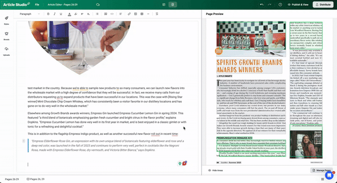
❗️If a content block doesn’t match the original, it will be highlighted in orange for manual editing.
Here's the color code explanation:
⚪ content not added
🟢 the extracted content matches the PDF
🟠 the content is either summarized or altered; needs manual touch-up
💡You can hide the highlighted areas if it helps to have an organized look of the pages preview..gif?width=630&height=815&name=REC-20251121193414-ezgif.com-video-to-gif-converter%20(1).gif)
Article Studio headbar
| File | |
 |
Takes to your Joomag dashboard |
 |
Allows renaming the publication and article titles |
 |
Takes to the publication Info section |
 |
Takes to the publication pages management section |
 |
Takes to the collection viewer settings |
 |
Indicates the saving process |
 |
Takes you to the Creative Studio/editing mode of the current page |
 |
Undo an action |
 |
Redo an action |
 |
Takes to the Help Center |
 |
Makes the article live and takes to the article preview |
 Distribute Distribute |
|
 |
Allows pushing the publication live |
 |
When hovered over, it indicates the privacy of the publication |
 |
Copy the publication short link |
 |
Shows the QR code of the publication |
 |
Opens the Analytics of the current publication |
 |
Takes to CRM |
 |
Allows to publish the article |
 |
Copies the full article URL |
Text editing toolbar
Select the text to apply the following formatting:
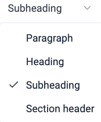 |
Allows to choose the type of the text |
 |
Makes the text bold |
 |
Makes the text italic |
 |
Underlines the text |
 |
Changes the text color |
 |
Highlights the text |
 |
Positions the selected text half a character above the normal line |
 |
Positions the selected text half a character below the normal line |
 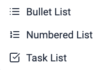 |
Creates a series of items broken up by bullet list, numbered list or task list |
 |
Adds the text into quotation |
 |
Formats the text as a code snippet |
 |
Opens the text alignment tool |
Image Settings
Select an image and click the pencil button to access the image settings: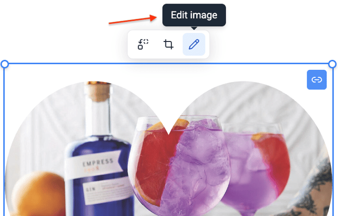
The image settings will open up on the left side:
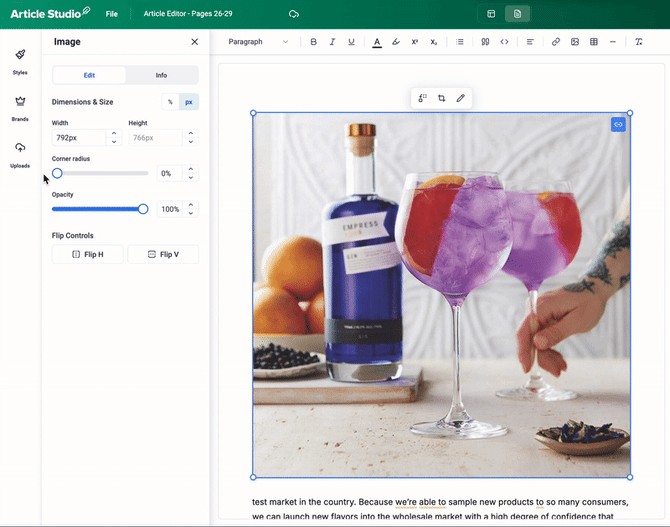
- In the Edit section you can change dimensions of the image by either typing in % or pixels:
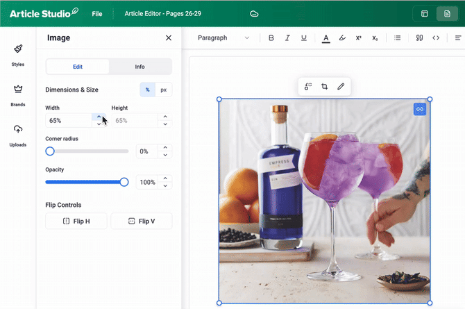
- To make the image corners more round, adjust the value of the corner radius:
- It's also possible to adjust the opacity of the image:
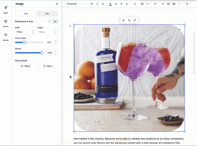
- You can flip an image by height or width using an image editor's flip tool:
-gif.gif?width=670&height=529&name=flip-ezgif-com-video-to-gif-converter%20(3)-gif.gif)
- Info section:
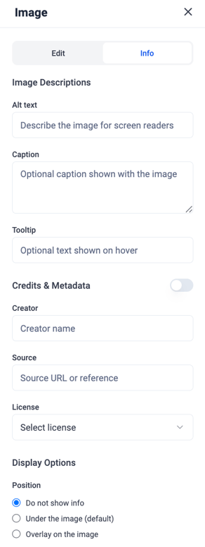
This section is designed to add accessibility details, descriptive text, and attribution information to images in your articles. It helps make your content more accessible for screen-reader users, provides optional captions or tooltips for readers, and allows you to properly credit image sources and choose how that information is displayed.
Alt Text
Write a short description of the image so screen readers can interpret it for visually impaired users.
Caption
An optional line of text that appears beneath the image.
Tooltip
Optional text that appears when someone hovers over the image.
Creator
Name of the person or organization who created the image.
Source
A URL or reference showing where the image came from.
License
Select the appropriate usage license for the image.
Display Options - Position
Choose where the image information is displayed
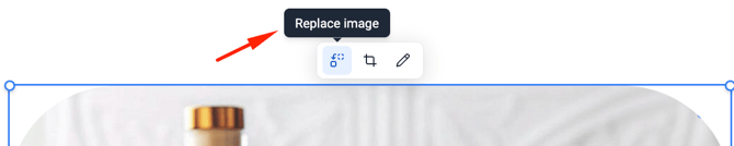
- To replace an image, select it and click on the first button to choose a new item from the media library:
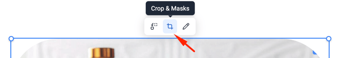
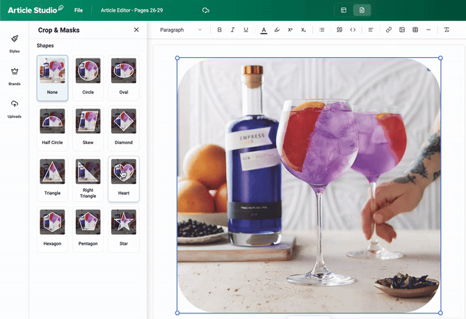
- To apply masks, click on the Crop button:
Other tools
 |
Add a link to the page or an element |
 |
Insert an image |
 |
Add column |
 |
Add a divider to the page |
 |
Clear the formatting of the elements |
 |
Open media library. Learn how to work with the media Library here. |
Create styles
Within the article editor, you have access to predefined formatting styles that help maintain consistency across your articles. You can select from the available system styles, create custom styles to fit your brand, and adjust them at any time. The styles menu enables you to combine color palettes with text and font options, or choose each element separately to match your publication’s needs.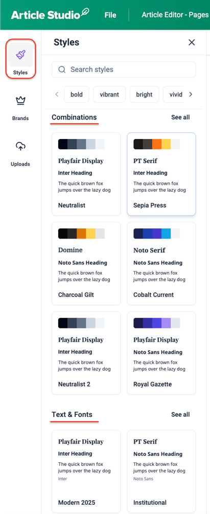
💡 Click "See all" to view more options: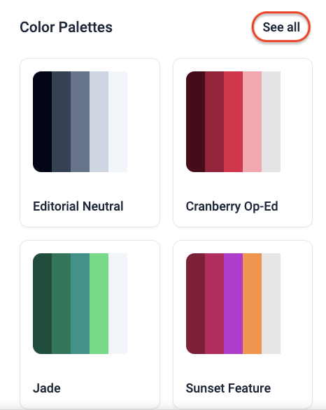
To apply a combination of text styles or a color palette, simply click on the desired style block..
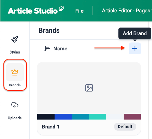
Create a brand kit from scratch
Customize your article branding by setting your preferred typefaces, font sizes, styles (Bold or Italic), and line spacing. Brand presets combine typography and color palettes, and can be created for titles, subtitles, headings, subheadings, section headers, body text, quotes, and captions.
To create a brand kit:
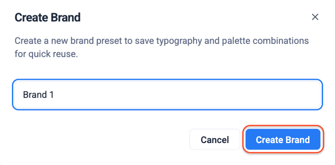
- Go to the Brands section and click + sign:
- Give the brand kit a title and click Create Brand:
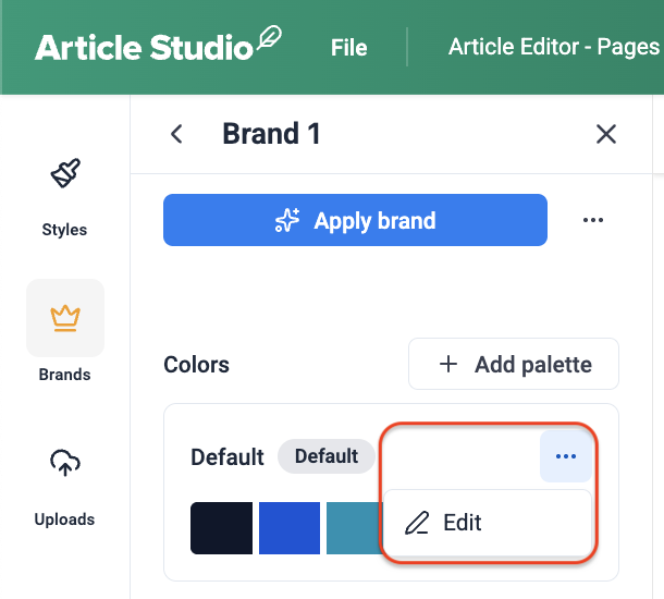
- To set the colors for the kit, click the meatball menu and then Edit:
- Modify the default colors, give the pallette a name and add more colors to the pallette. Once done, click Save.
- To edit text styles, click See all and then the pencil
 icon to modify each text section:
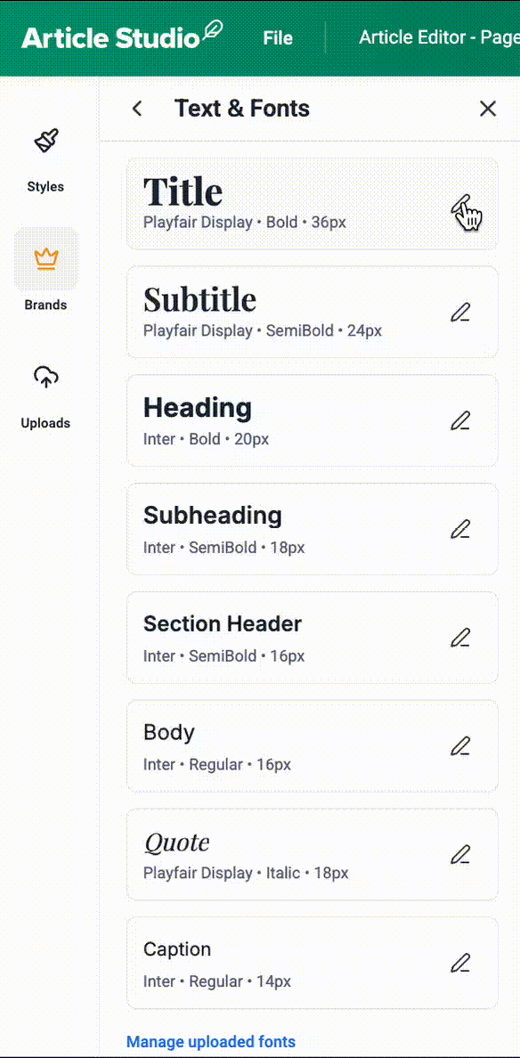
- To upload new fonts as well as to see the existing font list, click Manage uploaded fonts:
❗️Article Studio supports TTF and OTF files up to 1MB each.
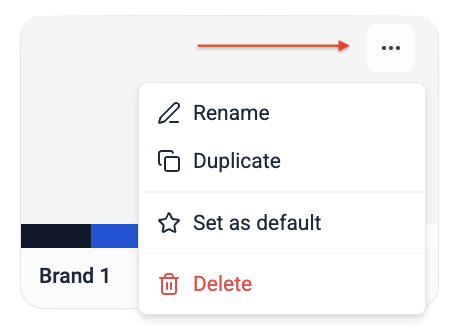
You can also rename, duplicate, delete and set a brand kit as default from the meatball menu: