Add a button to Standard email templates
Joomag's Standard Email Template Editor provides you with an opportunity to add customizable buttons to your standard email templates and link them to the page you want.
Use the following guideline to add a button to the email template:
Note: You are supposed to be logged in to Joomag and be on the Joomag dashboard page.
1. From the Content tab, select BUTTON and drag it to the place you want.
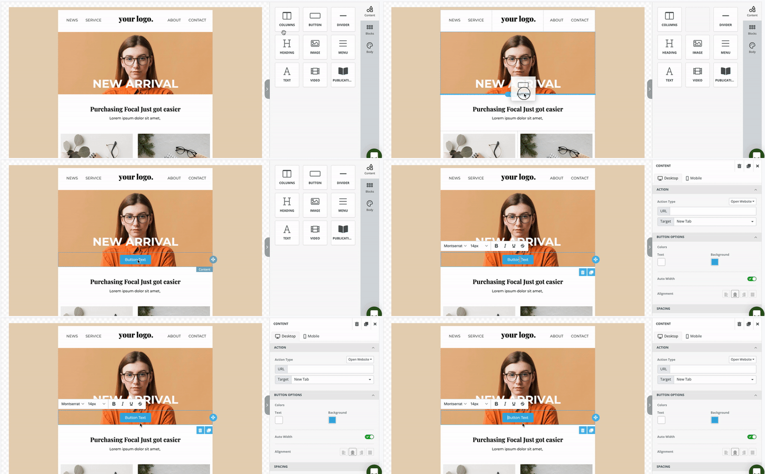
2. Click on the button and give a name to it. Then, change its font, font size, make it bold, italic, underline or strikethrough the text.
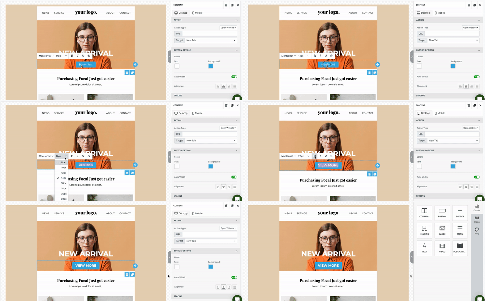
Click on the button to open the settings panel on the right side of the editor. The styling options for the button are divided into the following sections:
Important: The styling options applied for the desktop are also applied to the mobile. To change the styling for mobile devices click the Mobile tab on the settings panel.
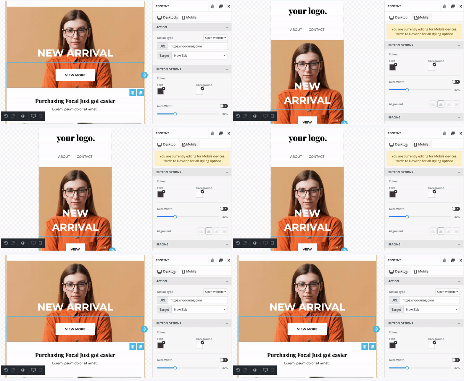
Action
In this section, you can select the type of action performed when the user clicks on it. In the editor, the following actions are available:
Open Website
Redirects the user to your mentioned URL. You should enter the URL and select how to open the URL on the same or new tab.

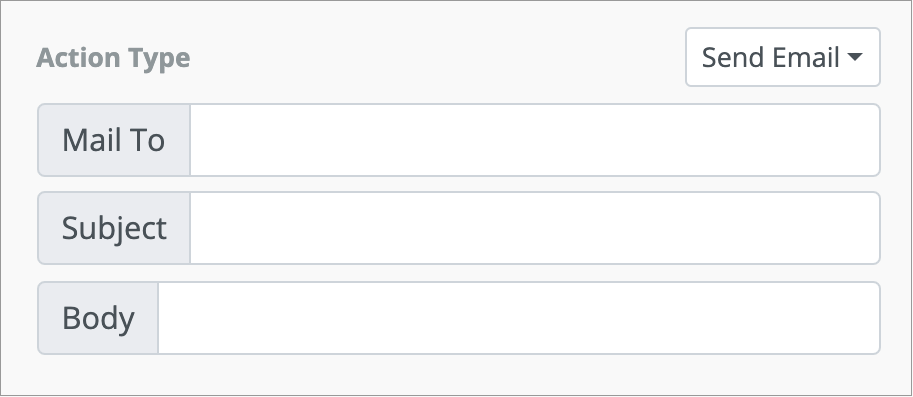
Send Email
The action opens an email box. You should enter the email address where you want the emails to be sent. You can also add the subject and body of an email which users can modify before sending.
Call Phone Number
Makes a call to the phone number that you've provided.

Send SMS
This lets the user send an SMS to the phone number that you've provided.

Note: The actions are the same both for the mobile and desktop views. You can't change it based on the mode.
Button Options
You can change the color, width, and alignment of the button.
Color
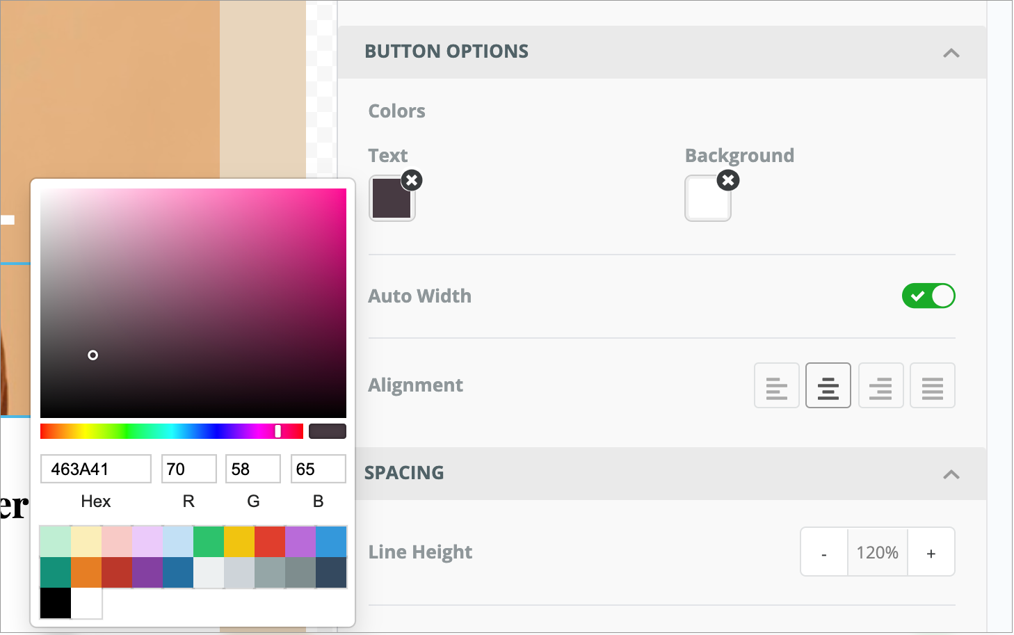
Change the color of both the text and background in any of the following ways:
-
Click the Fill Color to open the Color Picker, and then select the required color.
-
Enter the hexadecimal code.
-
Enter the RGB code.
Width
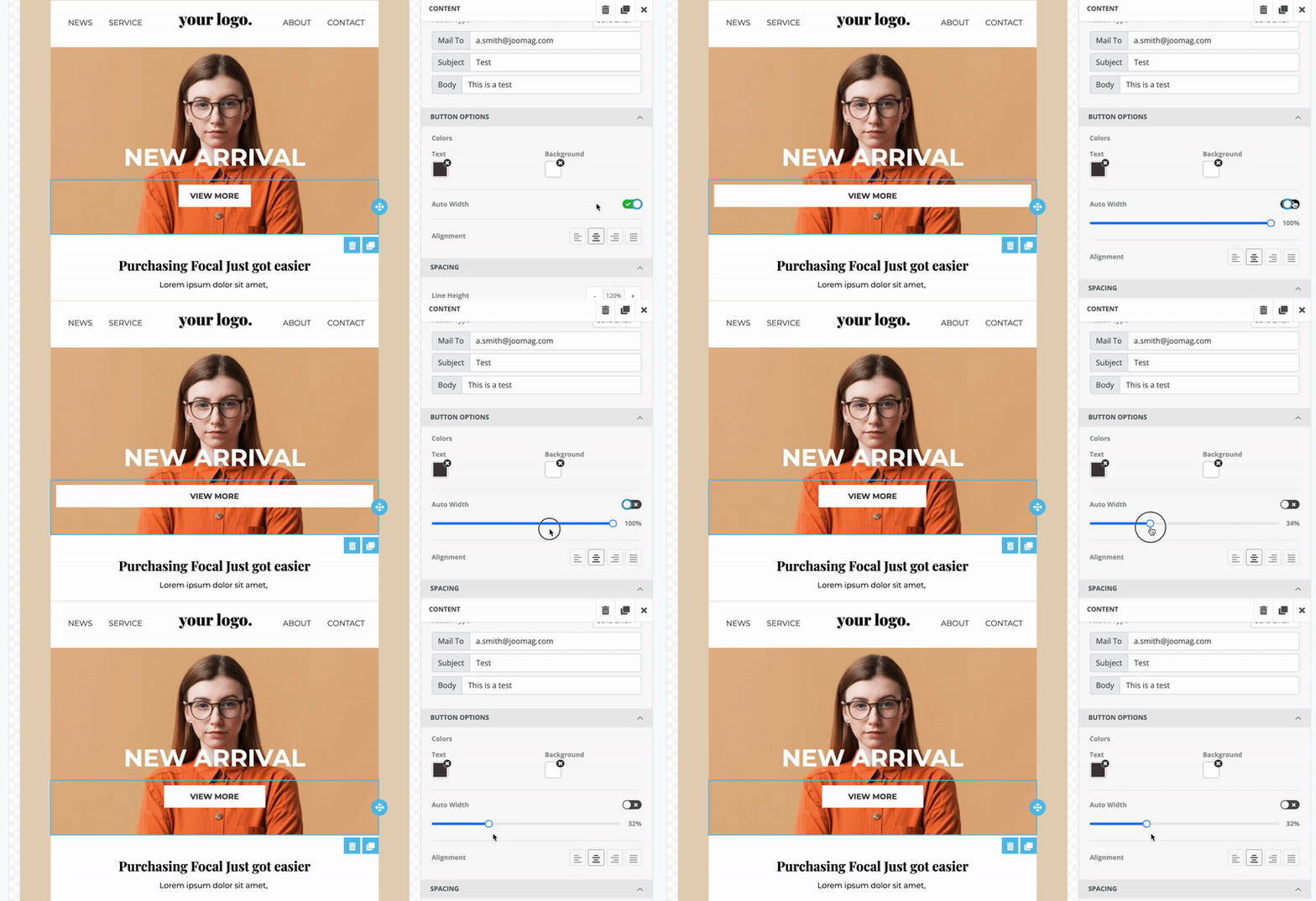
The width of the button is defined automatically by the system based on the text. But, you can turn off the Auto Width toggle and set the button's width by yourself.
Alignment
Tables can't be imported directly. Please insert an image of your table which can be found here.

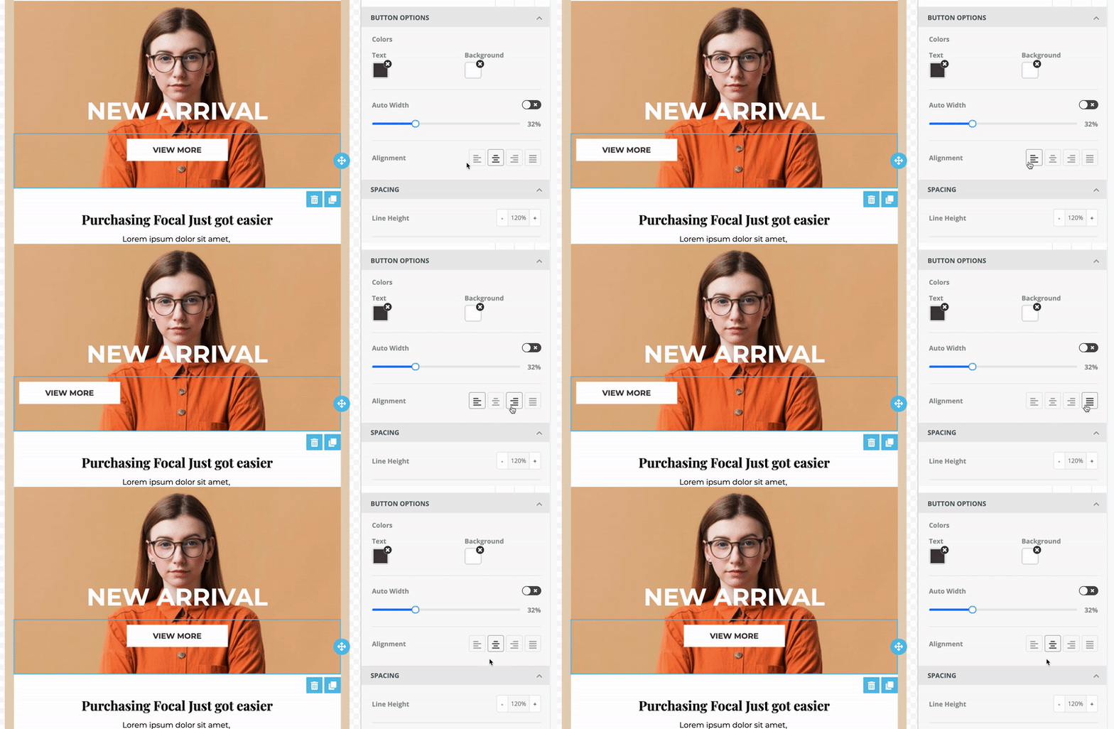
Align left
Aligns the divider along the left side of the template

Align center
Centers the divider leaving an even gap on each side of the template

Align right
Aligns the divider along the right side of the template

Justify all lines
Gives the divider straight edges on both sides
Spacing
The section allows you to play with the spacing of lines, texts, and borders.
Line height
Line height sets the vertical space between lines of text. To change the height, do any of the following:
-
Enter the height in the Line Height field.
-
Use the arrows to change the height.


Padding
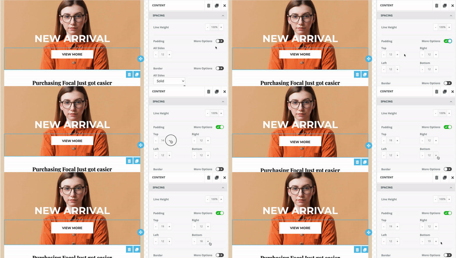
Padding sets the space between the content and its outside border.
By default, the spacing is set to be changed for all sides evenly. However, if you want to set different spacing based on the side, turn on the More Options toggle and make your modifications.
Border
The editor allows you to select border type, define its thickness, and choose a color.
All the sides can have the same border styling, or you can turn on the More Options toggle and define different styles for all sides.
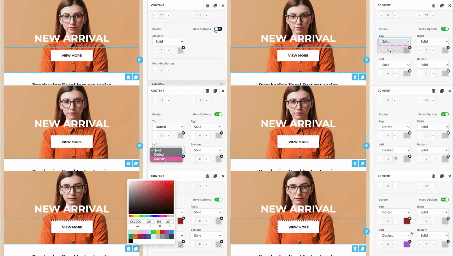
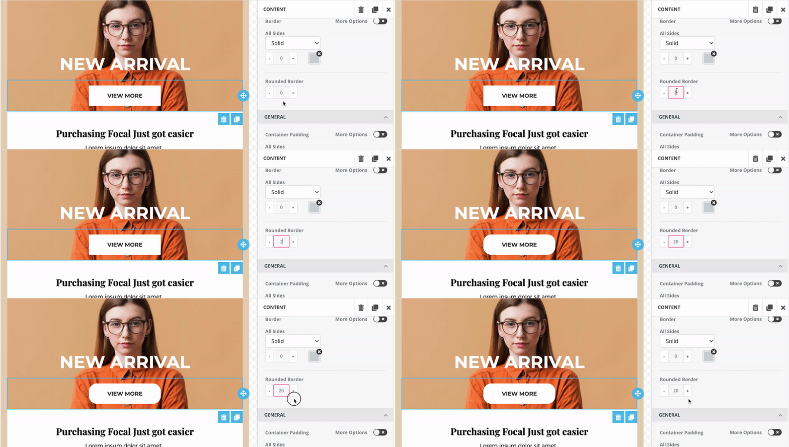
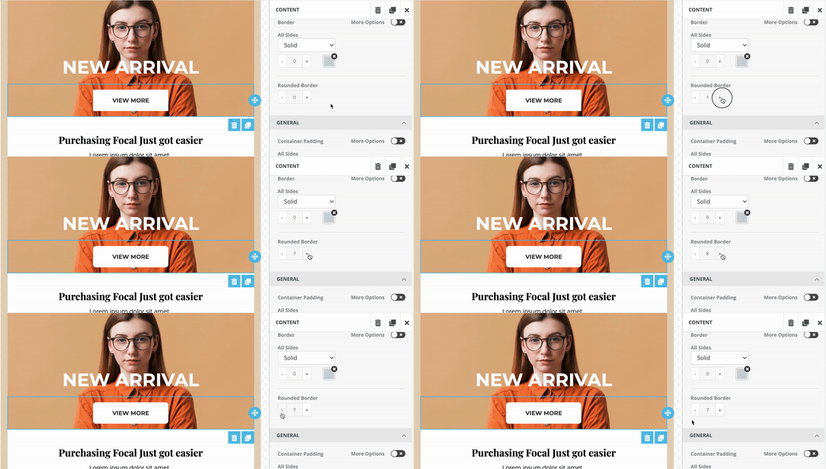
You can also change the corners of the button by making it rounded in any of the following ways:
-
Enter the number in the Rounded Border field.
-
Use the arrows to change the corners.
General
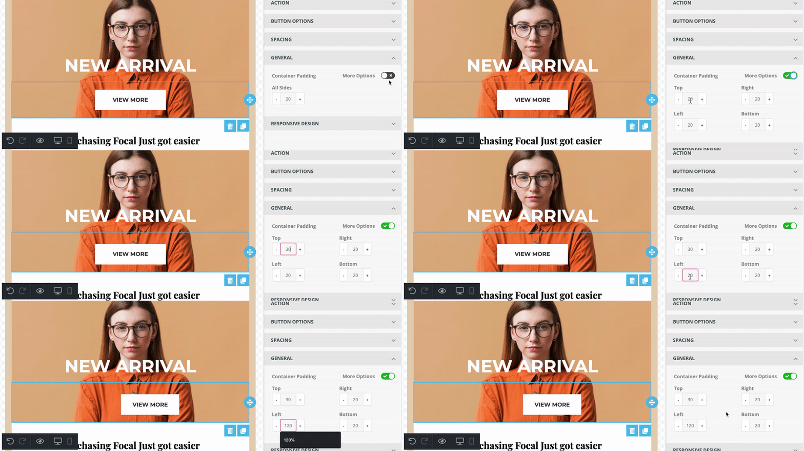
In this section, you can change the padding of the container. Container padding sets the space between the container and its outside border.
By default, the spacing is set to be changed from all sides evenly. However, if you want to set different spacing based on the side, turn on the More Options toggle and make your modifications.
Responsive Design
This section allows you to hide the created button on a desktop or mobile. So this way, you can create different buttons for desktop and mobile in the same template.
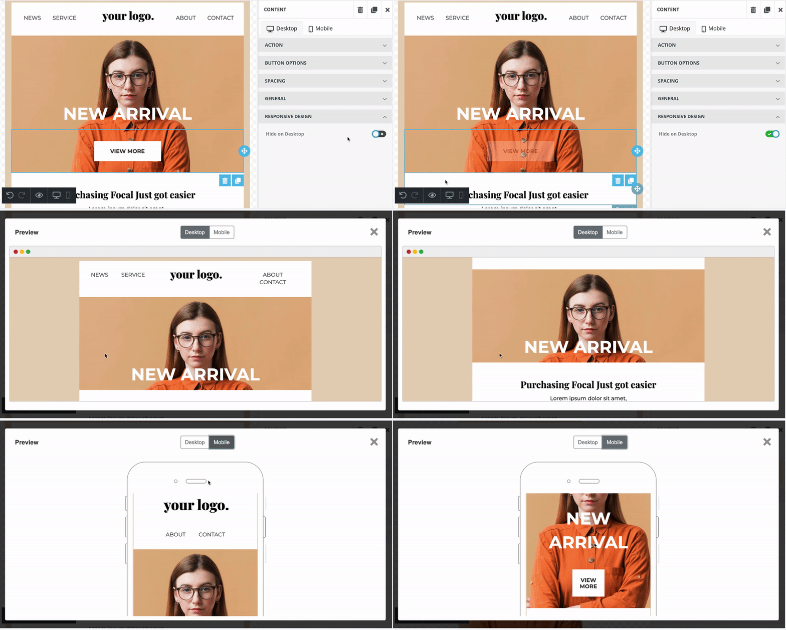
Always check how the email looks both on desktop and mobile and modify them for each device separately.
Once you are done with the editing, click Save to save your changes.
Duplicate and Delete
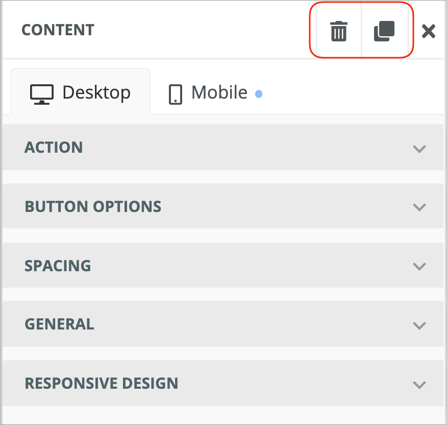
Any content block inserted from the Email Editor toolbar can be duplicated or deleted.

Joomag help: Learn more about the Standard campaign template editor.